


GENERAL ELECTRIC Identity Rebrand (2022)
The General Electric Company (GE) is an American multinational company, which started as an electricity company, but is now expanding into three areas: electricity, aviation, and healthcare. Additionally, it is making it's transition from a manufacturing company to a digital company. Their current aim is to sell not just products but solutions based on technology.
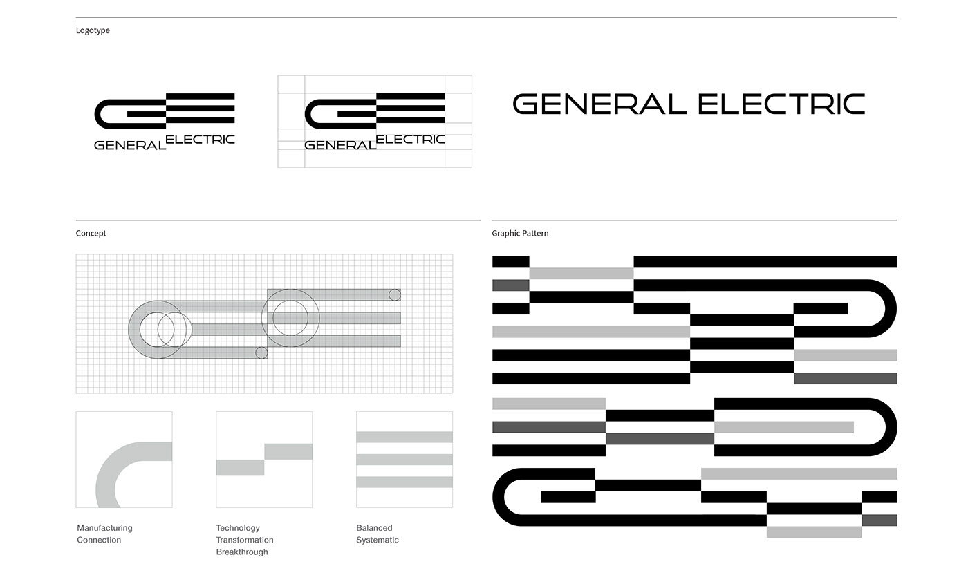
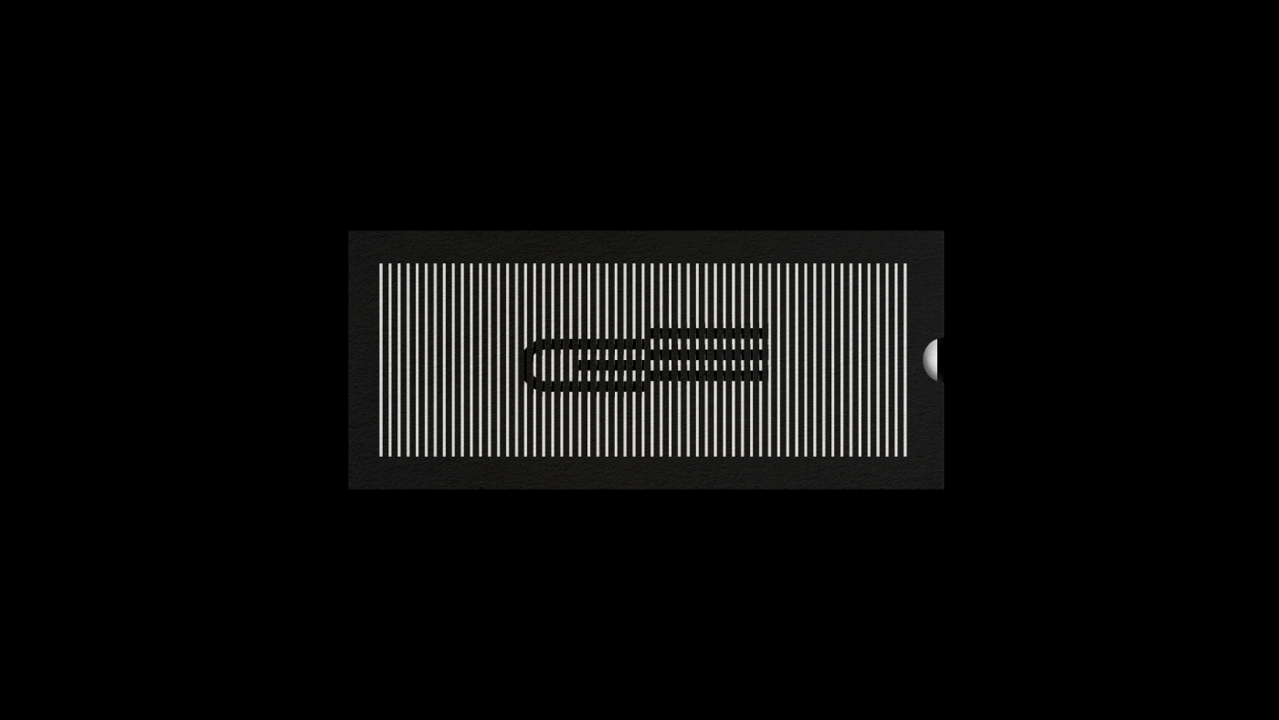
The new logo with the GE initials is geometrical and successfully relays its most important brand message. The logo mark “GE” means the speed of innovation and breakthrough of technology. Geometric forms represent manufacturing, engineering, and IT. The straight line represents the company’s aspirations for the future and speediness of growth. The optical friction between G and E represents breakthroughs or new changes in technology. This transition approach may also be applied throughout the graphic language.


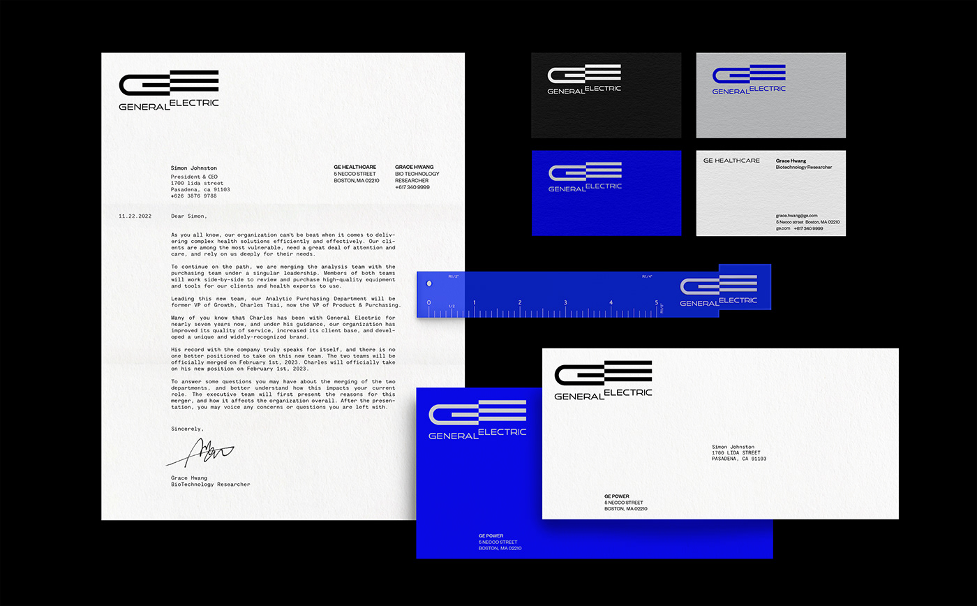
Brand System Design
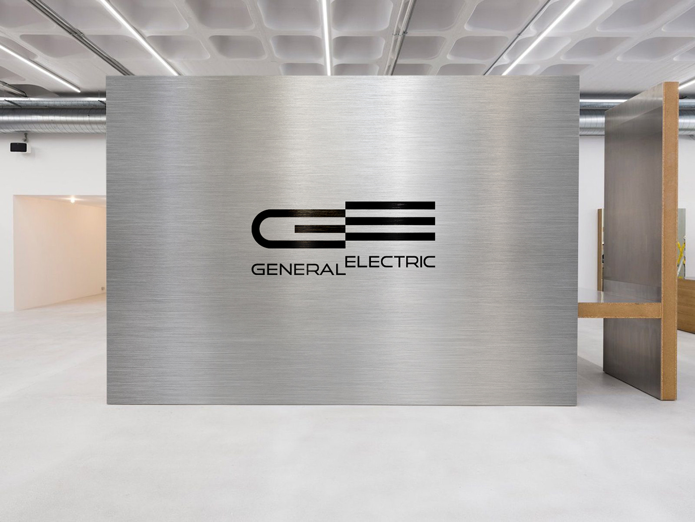
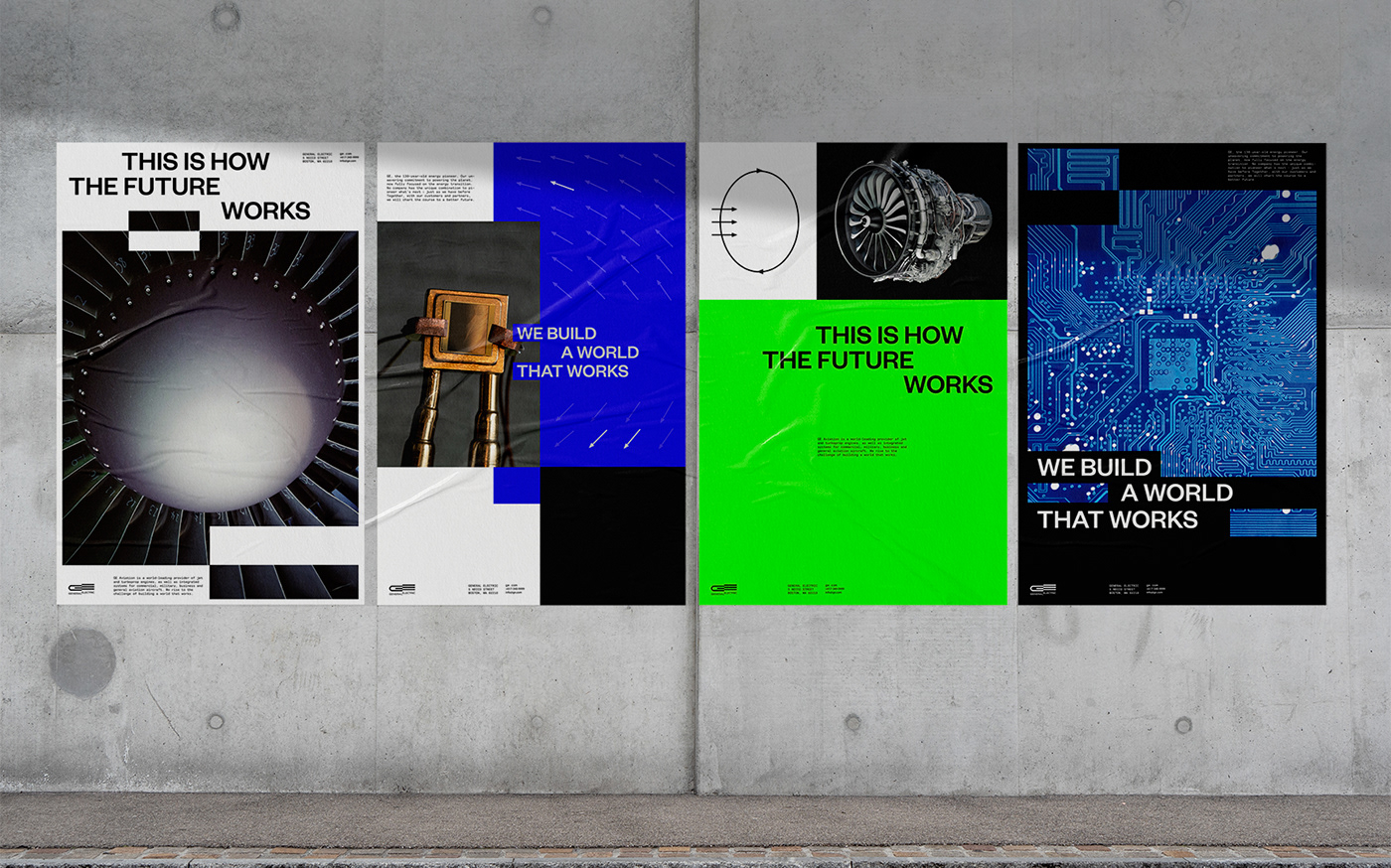
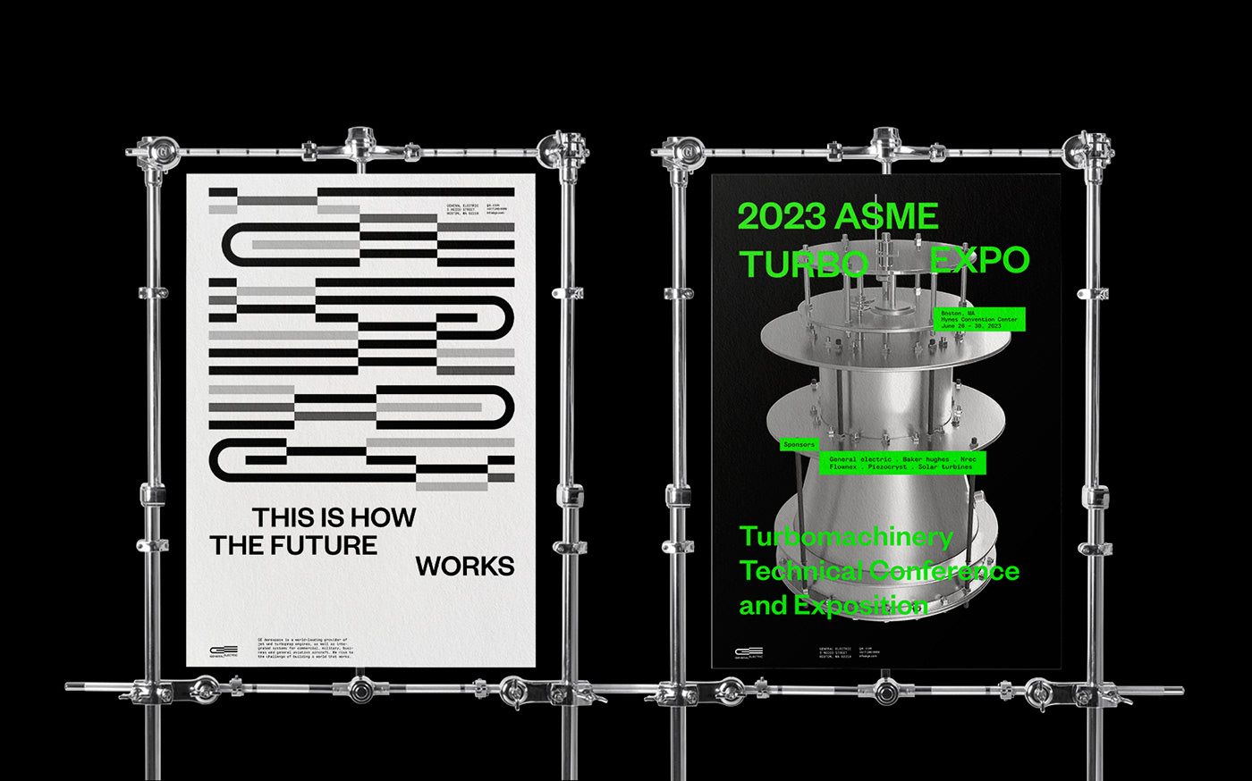
The optical friction in the logo is applied to all of the graphic identity. The brand color system is composed of a blue and grayscale color palette, which creates an IT, technology, and mechanical atmosphere. As a brand material, silver also makes a cohesive brand identity. For the brand poster series, the color is used with the same brand color system, by adding a neon green color.


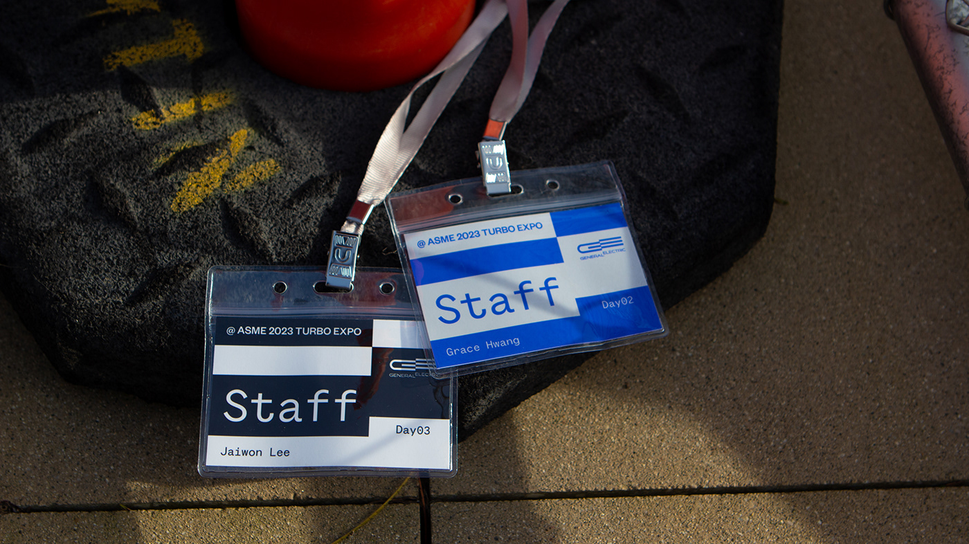
Expo Series System
In the expo series, the color was built with blue and grayscale colors as same as the brand system, adding a neon green color. By creating merchandise based on "offset" graphic language, it strong brand identity. Bookmarks and logo motion cards are examples of using graphic language expansion.


Thank you for viewing :)


